The Visual Capitalist chart is attractive, memorable, and considerably less objective than it appears
Visual Capitalist’s 2026 quality-of-life graphic places Sweden at the summit with a score of 100, followed by Denmark, Canada, Switzerland, Finland, and Norway. At the other end, Ukraine receives 0.0, Iran 1.8, and Lebanon 4.1. The United States sits at 48.6, apparently offering less than half the quality of life available in Sweden.
That is a powerful picture, but it’s not what the underlying research actually measured. The chart is based on the Wharton School’s 2026 Best Countries Index, which surveyed 15,131 people in 33 countries about their perceptions of 85 countries. The respondents were not principally asked to evaluate the country where they lived. Instead, they were shown random combinations of countries and descriptive attributes and asked which characteristics they associated with each country. The study was designed to examine national perceptions that can influence trade, tourism, and investment. In other words, this is fundamentally a country-brand survey, not a direct measurement of how well human beings are living.
What the index actually measures
The Wharton study identified 73 descriptive attributes and grouped them into ten categories, including entrepreneurship, power, cultural influence, social purpose, and quality of life. Respondents considered roughly one-third of the countries and about half of the attributes. When respondents said they had never heard of a country, that country was removed from their questionnaire. Country scores rose according to how often respondents associated them with favorable characteristics.
The quality-of-life category emphasizes perceptions of safety, health care, education, economic opportunity, stability, public services, affordability, and family friendliness. These are reasonable things to care about, but the survey does not directly measure their actual availability, cost, effectiveness, or distribution. It measures whether people believe a country possesses them. (LinkedIn)
This produces a large reputation effect. Sweden, Denmark, Switzerland, and Norway have spent decades developing international reputations for generous welfare systems, clean cities, competent institutions, and social stability. Those reputations are not inventions, and the Nordic countries also perform well in many empirical well-being studies. Nevertheless, asking an American, Brazilian, Indian, or German whether Sweden is “family friendly” is not equivalent to asking Swedish families whether they can find housing, access mental health treatment, afford food, or see a hopeful future for their children.
The effective sample for any particular country-attribute combination is also necessarily much smaller than 15,131 because every participant evaluated only a fraction of the countries and attributes. The published graphic gives every country a precise decimal score, but shows no uncertainty interval, sample size for each country-attribute pair, or indication that Sweden’s apparent 1.8-point advantage over Denmark might be smaller than the survey’s statistical noise.
A relative score is not a quantity of life
The scores were standardized and rescaled so that the leading country received 100, with the others positioned relative to it. This means Sweden’s 100 and the United States’ 48.6 are not ratio measurements. They don’t mean that a Swedish resident receives twice the happiness, twice the health, or twice the economic security of an American. Ukraine’s 0.0 doesn’t mean that life there contains literally no value, functioning institutions, social support, or personal satisfaction. It means Ukraine occupied the bottom of this particular relative perception scale during a major war.
The scale nevertheless invites ratio-like interpretation because it resembles a percentage. The bars make Sweden look full and the United States half empty. The visualization quietly turns a set of standardized opinions into something resembling a fuel gauge for national existence.
There’s another presentation choice worth noticing. Wharton evaluated 85 countries, while the graphic displays the 30 highest and 30 lowest. The middle 25 disappear. This creates a dramatic upper and lower world while concealing the broad, uncertain middle where many distinctions may be small.
The contradiction test
One way to test what an index really measures is to compare it with another index built from a different question.
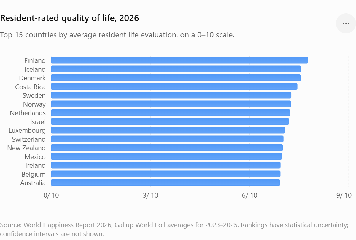
The World Happiness Report asks residents to evaluate their own lives using the Cantril ladder, a scale running from the worst possible life to the best possible life. Its ranking is not mechanically calculated from GDP, health care, or social support. Those factors are used to help explain the resident-reported life evaluations rather than determine them. (worldhappiness.report)
The differences between the two 2026 rankings are not small:
- Costa Rica receives only 13.5 in the Visual Capitalist graphic, placing it among the supposedly low-quality countries. In the World Happiness Report, Costa Rica ranks fourth.
- Israel receives 11.9 in the Visual Capitalist index but remains in the World Happiness Report’s top ten.
- Canada ranks third in the perception-based quality-of-life chart but 25th in resident-reported happiness.
- The United States ranks 28th in the Visual Capitalist graphic and 23rd in the World Happiness Report.
The Nordic countries remain near the top under both systems, but Canada has fallen from sixth to 25th in the happiness rankings since 2013, while Costa Rica has risen into the leading group. (worldhappiness.report)
This doesn’t prove that the World Happiness Report is perfectly correct and the Wharton index is completely wrong. It demonstrates that they’re measuring different objects. Wharton measures the international reputation of a country as a good place to live. The World Happiness Report measures how residents evaluate the lives they’re actually living.
A country can have a first-rate reputation and a population that is becoming less satisfied. Another country can lack an impressive global brand while its residents report strong family ties, social support, meaning, and contentment.
Where are mental health and substance-related harm?
A quality-of-life index should contain evidence about whether people are psychologically functioning, not merely whether outsiders associate their country with good hospitals. OECD estimates suggest that slightly more than one in five people in OECD and European Union countries experienced a mental disorder in 2023. Across the European Union, estimated anxiety-disorder prevalence increased from 4.8 percent in 1990 to 8 percent in 2023, while major depressive disorder increased from 2.2 percent to 3.1 percent. Mental disorders were most prevalent among people aged 15 to 24, exceeding 26 percent, and only about one-third of people with mental health needs received treatment during the preceding year. (OECD)
Depression, anxiety, and alcohol use disorders are projected to reduce healthy life expectancy across European Union countries by an average of 2.5 years. The OECD estimates that their effects on employment, absenteeism, and productivity reduce economic output as well as human well-being. (OECD)
Substance use also requires more careful measurement than simply counting everyone who consumed an illegal drug. The United Nations Office on Drugs and Crime estimates that approximately 316 million people, about 6 percent of the world’s population aged 15 to 64, used a controlled drug in 2023. But use is not the same as addiction, impairment, or social collapse. A useful quality-of-life index should measure the percentage of people with alcohol or drug use disorders, fatal overdose rates, alcohol-attributable mortality, treatment access, and the number of healthy years lost. (UNODC)
Suicide mortality should also be included, although never used alone. Suicide is associated with depression and alcohol use disorders, but it is also influenced by financial distress, family breakdown, chronic pain, access to lethal means, reporting practices, and cultural stigma. A bundle of suicide, overdose, psychological distress, treatment access, and resident-reported well-being would be much more informative than any single number. (World Health Organization)
Countries with lower stigma, stronger diagnostic systems, and more honest surveys can report more mental illness than countries where people conceal symptoms or never see a clinician. Self-reported symptoms should be combined with mortality, hospitalization, disability, treatment availability, and standardized diagnostic instruments.
GDP is necessary, but the average person cannot spend GDP
Economic output matters because extreme poverty, unemployment, food insecurity, and unstable public finances damage well-being. Yet GDP per capita can rise while the median household becomes less secure.
A credible economic component should therefore use median disposable household income adjusted for purchasing power, not merely mean GDP. It should also include after-tax poverty, housing costs as a percentage of disposable income, unemployment and underemployment, household debt burdens, job security, wealth concentration, and the share of people unable to cover an emergency expense.
This is close to the logic of the OECD Well-being Framework, which tracks more than 80 indicators across 11 dimensions: income and wealth, housing, work and job quality, health, knowledge and skills, environmental quality, work-life balance, social connections, civic engagement, safety, and subjective well-being. It also examines inequalities within countries rather than pretending the national mean represents everyone equally. (OECD)
That distributional element is essential. Quality of life in the United States, Canada, South Africa, China, or the United Kingdom cannot be described adequately by one national average. A wealthy homeowner, a young renter, a recent immigrant, a rural worker, and a single parent may be living inside very different economic systems while sharing the same flag.
An index should publish results by age, income quintile, region, sex, employment status, and housing tenure. A country with a high average but severe distress concentrated among young adults should not receive the same score as one where gains are broadly shared.
What a better index would measure
I would build the index around six domains, with the raw measurements published beside the final score.
| Domain | Measures that belong in it |
|---|---|
| Resident well-being | Life satisfaction, positive and negative affect, sense of purpose, hope, freedom to make life choices |
| Mental health and substance harm | Depression and anxiety prevalence, alcohol and drug use disorders, suicide, overdose mortality, unmet treatment need |
| Material security | Median disposable income, poverty after taxes and transfers, housing burden, employment security, emergency savings |
| Physical health | Healthy life expectancy, avoidable mortality, chronic disease burden, unmet medical need |
| Social fabric | Social support, loneliness, trust, family and community connection, time spent with others |
| Safety, freedom, and environment | Homicide and victimization, political and personal freedom, corruption, air pollution, commute time, access to green space |
Subjective well-being should remain prominent because people are the final judges of whether their own lives are going well. The OECD recommends distinguishing among life evaluation, emotional experience, and eudaimonia, meaning purpose, agency, and whether life feels worthwhile. Nearly 90 percent of OECD countries now collect some form of life-satisfaction data in their official statistics. (OECD)
But subjective ratings should not become another monoculture. Cultural differences affect how people use rating scales, and recent research suggests that country rankings can shift when researchers change the wording from a Cantril ladder to a life-satisfaction question. The determinants of well-being appear more robust than the precise ordinal ranking of countries. (arXiv)
A transparent scoring model
One reasonable starting model would assign 30 percent to resident-reported well-being, 20 percent to mental health and substance-related harm, 20 percent to material security, 10 percent to physical health, 10 percent to social connection, and 10 percent to safety, freedom, and environmental quality.
Those weights are value judgments, which is why the index should also publish alternative rankings under different plausible weights. If Sweden ranks first under almost every weighting scheme, that is a robust result. If Canada moves from third to 25th when housing affordability or resident life satisfaction receives slightly more weight, readers deserve to see that instability.
The index should also publish data years, missing values, confidence intervals, and sensitivity tests. It should use rolling averages for rare events such as suicide and overdose deaths, avoid mixing data from 2018 in one country with data from 2025 in another, and show both national averages and outcomes for the bottom income quintile.
Most importantly, it shouldn’t hide the measurements beneath the ranking. A country may have high life satisfaction but poor housing affordability, low suicide mortality but widespread anxiety, or high income accompanied by loneliness and weak social trust. Those patterns are more useful than declaring that Country A is 3.7 points better than Country B.
What the Visual Capitalist chart is actually good for
The Visual Capitalist graphic provides a useful picture of international reputation. It shows which countries the global survey audience associates with safety, public services, stability, and a comfortable life. National reputation can influence migration, tourism, investment, and the ability to recruit skilled workers. The problem is the label; a more accurate title would be:
Countries Most Widely Associated With a High Quality of Life in 2026
A real quality-of-life must ask residents whether their lives are going well, examine whether they are becoming depressed, addicted, isolated, sick, homeless, or financially trapped, and determine whether prosperity reaches ordinary households rather than pooling at the top.people inside are actually living.