What changes when we stop asking which countries look good and start asking residents whether life is getting better?
The Visual Capitalist chart ranking countries by quality of life in 2026 is visually convincing because it presents national reputations as though they were measurements of lived experience. Sweden receives a perfect 100, Canada scores 95.0, Switzerland 94.8, and Australia 87.5. At the bottom, Lebanon, Iran, Ukraine, and several developing countries appear to offer almost no quality of life at all.
The underlying Best Countries study, however, asks an international sample which qualities they associate with different countries. The result is useful for measuring national image, but it is not a direct measurement of whether residents are becoming more satisfied with their own lives. Visual Capitalist accurately describes the source as a survey of perceptions from 15,131 adults across 33 countries, but the precision of its index can make those perceptions look more objective than they are. (Visual Capitalist)
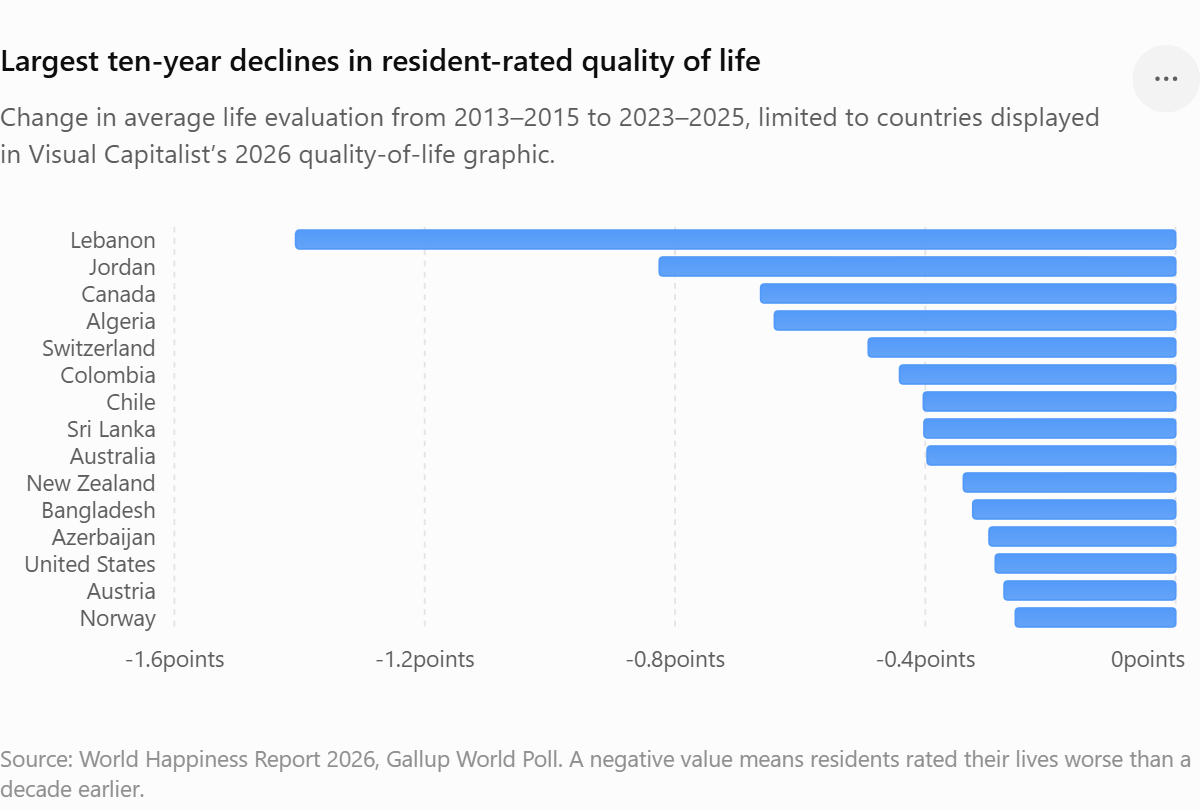
A better question is: Where have resident life evaluations deteriorated during the past decade, and does the international reputation of those countries reflect that decline?
To answer that question, I compared the countries displayed in the Visual Capitalist graphic against the World Happiness Report’s resident-reported life evaluations. The comparison uses the average Cantril Ladder score for 2013–2015 as the starting point and the average for 2023–2025 as the ending point. Respondents rate their own lives from zero, representing the worst possible life, to ten, representing the best possible life. The World Happiness Report publishes the three-year averages, confidence intervals, and explanatory components behind its rankings. (worldhappiness.report)
This is still not a perfect measure of total human welfare. It does, however, ask people about the lives they are actually living, rather than asking foreigners what they associate with the country’s flag.
The largest declines among countries in the Visual Capitalist chart
The following table ranks countries by the change in their resident life-evaluation score. A negative number means residents rated their lives less favorably in 2023–2025 than they did in 2013–2015.
| Downward rank | Country | Visual Capitalist perception score | 2013–2015 resident score | 2023–2025 resident score | Ten-year change | Global rank change |
|---|---|---|---|---|---|---|
| 1 | Lebanon | 4.1 | 5.129 | 3.723 | −1.406 | 93 → 141 |
| 2 | Jordan | 10.6 | 5.303 | 4.478 | −0.825 | 80 → 119 |
| 3 | Canada | 95.0 | 7.404 | 6.741 | −0.663 | 6 → 25 |
| 4 | Algeria | 8.0 | 6.355 | 5.714 | −0.641 | 38 → 83 |
| 5 | Switzerland | 94.8 | 7.509 | 7.018 | −0.491 | 2 → 10 |
| 6 | Colombia | 9.7 | 6.481 | 6.040 | −0.441 | 31 → 68 |
| 7 | Chile | 15.6 | 6.705 | 6.302 | −0.403 | 24 → 50 |
| 8 | Sri Lanka | 9.2 | 4.415 | 4.013 | −0.402 | 117 → 134 |
| 9 | Australia | 87.5 | 7.313 | 6.916 | −0.397 | 9 → 15 |
| 10 | New Zealand | 74.0 | 7.334 | 6.995 | −0.339 | 8 → 11 |
| 11 | Bangladesh | 11.3 | 4.643 | 4.319 | −0.324 | 110 → 127 |
| 12 | Azerbaijan | 7.0 | 5.291 | 4.993 | −0.298 | 81 → 102 |
| 13 | United States | 48.6 | 7.104 | 6.816 | −0.288 | 13 → 23 |
| 14 | Austria | 76.7 | 7.119 | 6.845 | −0.274 | 12 → 19 |
| 15 | Norway | 92.4 | 7.498 | 7.242 | −0.256 | 4 → 6 |
These calculations use the official World Happiness Report spreadsheet for Figure 2.1. The score change is more meaningful than the change in rank because rankings also depend on what happened in every other country and on which countries had sufficient survey data. The report’s current ranking period is 2023–2025. (worldhappiness.report)
Belarus and Oman were not included in the delta ranking because the published spreadsheet did not contain comparable values at both endpoints.
Lebanon: the index sees the wreckage, but not the fall
Lebanon shows the largest decline, losing 1.406 points on a ten-point scale and falling 48 places in the global resident-life-evaluation ranking. In this case, the Visual Capitalist perception score and resident experience point in the same direction. Lebanon’s reputation has caught up with its crisis. What the static chart cannot show is the scale of the deterioration. Lebanon was not always near the floor. Its 2013–2015 resident score of 5.129 was unexceptional but far from catastrophic. By 2023–2025, it had fallen to 3.723.
The World Bank describes Lebanon’s collapse as a compound economic, financial, political, and institutional crisis. Its economy was hit by a sudden stop in capital inflows, banking and currency failures, the pandemic, the Beirut port explosion, political paralysis, and renewed armed conflict. The World Bank estimated that dollar-denominated GDP fell from almost $55 billion in 2018 to approximately $33 billion in 2020, with GDP per person falling by about 40 percent. Its later reports describe a prolonged depression followed by only a fragile and uneven stabilization. (World Bank)
A static low ranking tells us that Lebanon is suffering. The ten-year delta tells us something more important: an ordinary, imperfect country went over an economic cliff.
Jordan: stability is not the same as well-being
Jordan experienced the second-largest decline, falling from 5.303 to 4.478 and dropping 39 ranking positions. Jordan is often described internationally through the language of stability. Compared with several of its neighbors, it has avoided state collapse and large-scale domestic warfare. That reputation can obscure the accumulating burden carried by ordinary residents: limited job creation, persistent youth unemployment, resource scarcity, pressure from refugee inflows, fiscal constraints, and a population that has grown faster than many public systems can comfortably support.
This exposes an important weakness in reputation-based quality-of-life measures. A country can be admired for being more stable than its neighborhood while its residents are simultaneously becoming less satisfied with their own lives. “Stable under difficult conditions” may be accurate. It doesn’t necessarily mean “life is improving.”
Canada: the largest rich-country warning
Canada is the most important contradiction in the comparison. Visual Capitalist places Canada third in the world for perceived quality of life with a score of 95.0. Yet Canada experienced the third-largest decline among all 60 countries shown in the graphic and the largest decline among the affluent democracies. Its resident score fell from 7.404 to 6.741. Its global position dropped from sixth to 25th. Canada still has functioning institutions, high educational attainment, extensive public services, political stability, and a strong international brand. None of that is imaginary. The problem is that its reputation appears to be measuring the Canada outsiders remember more than the Canada many residents currently experience.
Housing is likely part of the fracture. Across OECD economies, housing costs have risen faster than incomes, eroding disposable income and increasing insecurity, particularly among renters and younger households. OECD well-being reporting also warns that improvements in employment and average income coexist with worsening housing costs and declining self-reported financial well-being. (OECD)
Canada’s decline also fits a broader pattern of deteriorating well-being among young people in affluent countries. The OECD reports rising depression, anxiety, psychological distress, and poor well-being among younger populations, while emphasizing that the causes are probably interactive rather than reducible to one culprit. Economic uncertainty, inequality, social media, academic pressure, weakened social ties, housing barriers, and limited mental-health support can reinforce one another. (OECD)
A country can therefore continue to look excellent in an institutional brochure while becoming considerably harder to enter as a young adult. Canada’s 95.0 perception score is not false in the simple sense. It reflects a real inheritance of competent government, safety, education, and social order. But it’s stale. The national brand has not depreciated as quickly as the lived experience.
Switzerland: still excellent, but moving in the wrong direction
Switzerland remains one of the highest-scoring countries in absolute terms. Its current resident score of 7.018 places it tenth globally, which is hardly evidence of social failure. The important fact is the direction. Its score fell by 0.491 points, and it moved from second to tenth. Visual Capitalist nevertheless gives it 94.8, virtually tying it with Canada and placing it fourth in perceived quality of life.
This illustrates why levels and changes must be published together. Switzerland remains wealthy, safe, healthy, institutionally competent, and highly functional. A person choosing where to live might rationally prefer it to most countries on Earth. Yet the population’s evaluation of life has clearly softened.
The dashboard should say: High quality, negative trajectory. Instead, the graphic says only: High quality.
Australia and New Zealand: the shine remains while the score slips
Australia and New Zealand occupy a similar category. They retain strong global reputations built from political stability, natural beauty, relative safety, education, public health systems, and cultural familiarity to Western survey respondents. Yet Australia’s life-evaluation score fell by 0.397 points, while New Zealand’s fell by 0.339.
Both remain well above the global average, but both are moving downward. Housing affordability, cost-of-living pressures, access to services, social isolation, and uncertainty among younger adults are likely components of the decline, although the life-evaluation data alone cannot establish the causal contribution of each factor.
This is where a static reputation ranking becomes particularly complacent. Australia can remain one of the most desirable countries in global imagination even as the price of joining its middle-class life climbs beyond the reach of a growing share of its own population.
The United States: reputation and reality have both weakened
The United States fell from 7.104 to 6.816 and from 13th to 23rd in the World Happiness Report rankings. Visual Capitalist places it 28th among its high-quality group, with a relative perception score of 48.6. Unlike Canada, America’s international reputation appears to have partially incorporated its domestic strains. Political conflict, gun violence, health-care insecurity, economic inequality, visible homelessness, substance-related mortality, and social fragmentation are difficult to conceal behind national branding. Even so, the ten-year delta adds information that the static rank does not. The United States didn’t merely fail to match Nordic countries. Its residents evaluated their own lives less favorably than they had a decade earlier.
Not all low-ranked countries are declining
The delta analysis also overturns the opposite assumption: that countries with weak reputations must be getting worse. Several countries shown near the bottom of the Visual Capitalist graphic recorded substantial improvements in resident-rated life:
| Country | Visual Capitalist score | Ten-year resident-score change |
|---|---|---|
| Serbia | 8.6 | +1.514 |
| Dominican Republic | 9.9 | +0.938 |
| Poland | 59.6 | +0.933 |
| Portugal | 56.1 | +0.906 |
| Lithuania | 14.9 | +0.891 |
| China | 49.8 | +0.829 |
| Kazakhstan | 4.4 | +0.714 |
| Greece | 36.2 | +0.664 |
| Italy | 49.9 | +0.597 |
| Cameroon | 6.5 | +0.570 |
| Cambodia | 11.8 | +0.555 |
| South Africa | 8.6 | +0.550 |
Serbia is perhaps the clearest counterexample. It receives only 8.6 on the Visual Capitalist perception scale, yet its resident life-evaluation score improved by more than 1.5 points, the largest movement in either direction among the displayed countries. Portugal, Lithuania, Poland, Greece, Italy, and Kazakhstan also improved substantially. This doesn’t prove that these countries now provide better lives than Canada, Switzerland, or Australia. Most still have lower absolute resident scores. It means they’ve made progress that a perception snapshot does not capture.
Why national reputation changes slowly
National brands have inertia, Switzerland remains associated with order, prosperity, trains, mountains, banking, and competent government. Canada remains associated with safety, tolerance, public health care, and political moderation. Australia remains associated with space, sunshine, opportunity, and an easygoing culture. These associations were accumulated over decades. Negative reputations are similarly sticky. Serbia, Colombia, Cambodia, and several post-communist countries continue to carry historical associations that may lag behind improvements experienced by their residents.
Reputation is therefore a delayed indicator. It reacts to dramatic events such as war, state collapse, or hyperinflation, but it can take years to register gradual social improvement or deterioration. The Visual Capitalist graphic is effectively looking through a long-exposure camera. The World Happiness Report delta is closer to a motion detector.
What the decline ranking does and does not prove
Life evaluations are survey responses influenced by expectations, cultural norms, personal circumstances, recent events, and the way people interpret the Cantril Ladder. The ten-year comparison also uses rolling three-year averages rather than single-year observations. That is a virtue because it suppresses some sampling noise, but it means the endpoints overlap broader periods rather than representing two precise days. Differences of a few hundredths of a point should not be treated as meaningful national transformations. Sweden’s decline of 0.036 or Belgium’s decline of 0.003 is effectively stability for any reasonable journalistic interpretation. Larger changes are harder to dismiss. Lebanon’s decline of 1.406, Canada’s decline of 0.663, and Algeria’s decline of 0.641 are substantial movements on a ten-point life-evaluation scale.
Confidence intervals should ideally accompany each change, and a formal significance test would account for the uncertainty at both endpoints. The World Happiness Report publishes confidence intervals for its three-year averages, even though simple media rankings usually omit them. (worldhappiness.report)
The score also doesn’t tell us precisely why a country moved. GDP per person, social support, healthy life expectancy, freedom, generosity, and perceptions of corruption explain much of the cross-country variation, but they should not be mechanically interpreted as complete causal decompositions. The World Happiness Report uses these variables to explain observed life evaluations rather than to manufacture the ranking itself. (worldhappiness.report)
A better quality-of-life graphic needs two axes
A more informative chart would place countries on two dimensions:
- Current resident-rated quality of life
- Ten-year change in resident-rated quality of life
That would create four meaningful categories.
High and improving
These are countries already performing well and continuing to make progress. Finland and Costa Rica are examples among the countries displayed. Finland increased by 0.351 points and rose to first, while Costa Rica increased by 0.352 and reached fourth.
High but declining
Canada, Switzerland, Australia, New Zealand, Austria, Norway, and the United States belong here to varying degrees. Their existing institutions and wealth still produce comparatively strong life evaluations, but their direction should concern policymakers.
Low but improving
Serbia, the Dominican Republic, Kazakhstan, Greece, Cambodia, Cameroon, and South Africa demonstrate why low current standing should not erase evidence of progress.
Low and declining
Lebanon, Jordan, Algeria, Sri Lanka, Bangladesh, Azerbaijan, and Tunisia face the most troubling combination: weak current outcomes and negative momentum.
This two-axis approach replaces the beauty contest with a diagnosis.
The most important countries are not necessarily at the top or bottom
Rankings pull attention toward first and last place, but the most analytically important countries may be those where the level and trajectory disagree. Canada is not collapsing. It remains prosperous and institutionally stable. Yet its large decline is a warning that the social machinery producing its international reputation is no longer delivering the same results for residents. Serbia is not suddenly the best country in the world. Its current score remains below those of most Western European countries. Yet its improvement suggests that outsiders may be looking at an obsolete national portrait. Lebanon’s reputation and resident experience both indicate profound crisis, but the delta reveals the historical magnitude of what was lost. Costa Rica is nearly inverted from Canada: a modest global brand, a low Visual Capitalist perception score of 13.5, but the fourth-highest resident life evaluation in 2026 and a positive ten-year trajectory.