
There are aircraft that look fast sitting still, and then there is the SR-71 Blackbird. At more than 80,000 feet and Mach 3, the Blackbird operated in a part...
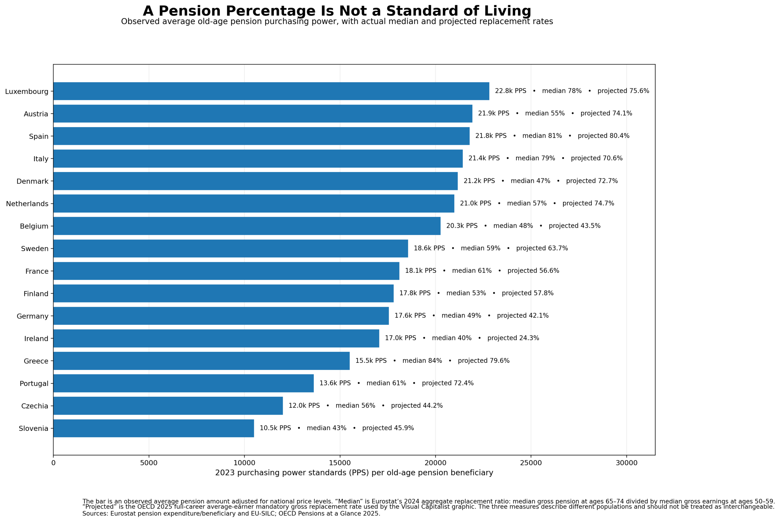
That “Generous Pension” Ranking Doesn’t Actually Rank Retirement Living Standards A recent Visual Capitalist graphic makes for an arresting comparison of retirement systems. Spain supposedly replaces 80.4% of a...
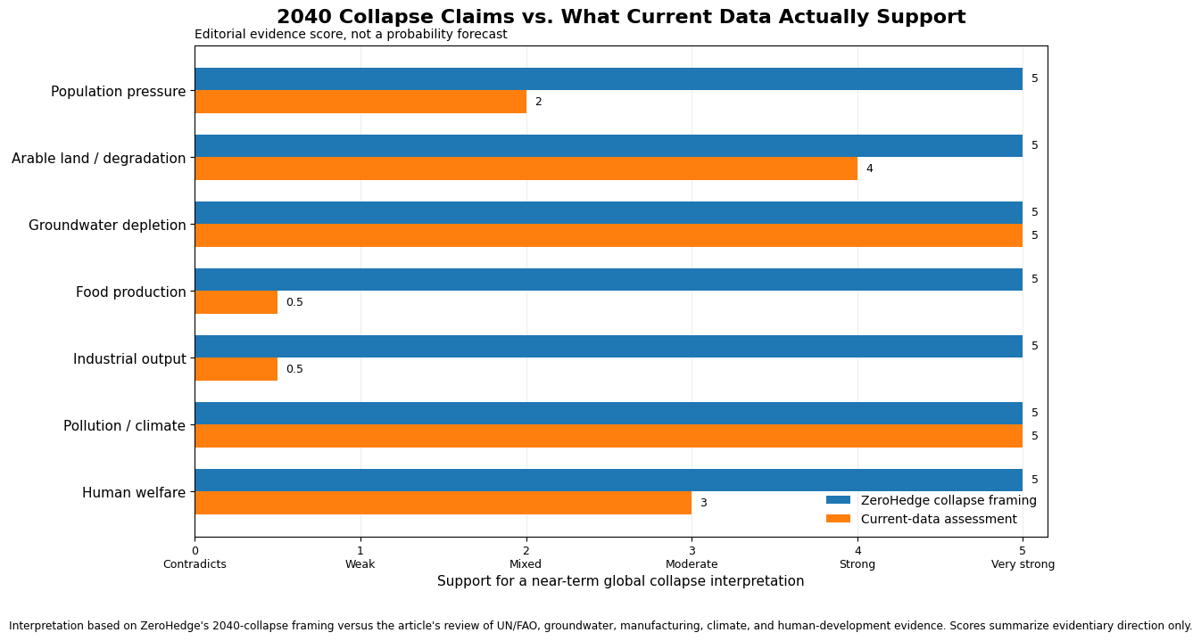
What the Data Says A recent article making the rounds under the title Society Collapse 2040: The Year the World Stops Working and Starts Dying resurrects one of the...
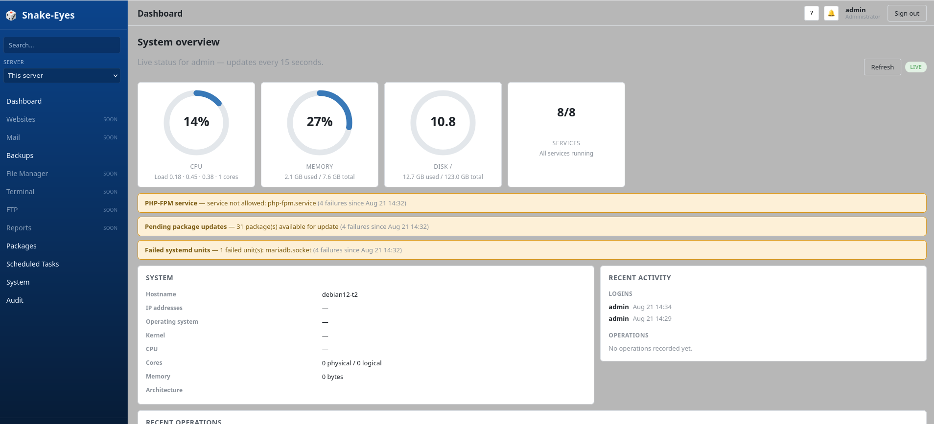
Moving enholm.net from HostGator to Hostinger taught me more than I ever wanted to know about web hosting For years, web hosting occupied a pleasant little corner of my...
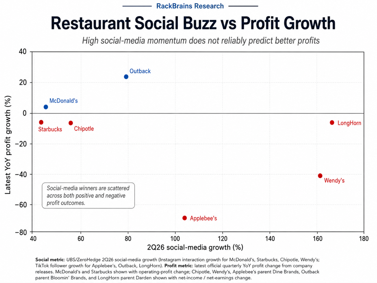
A recent ZeroHedge article, drawing on UBS Evidence Lab data, declares a collection of restaurant chains the winners of the second-quarter 2026 “social media war” for the attention of...
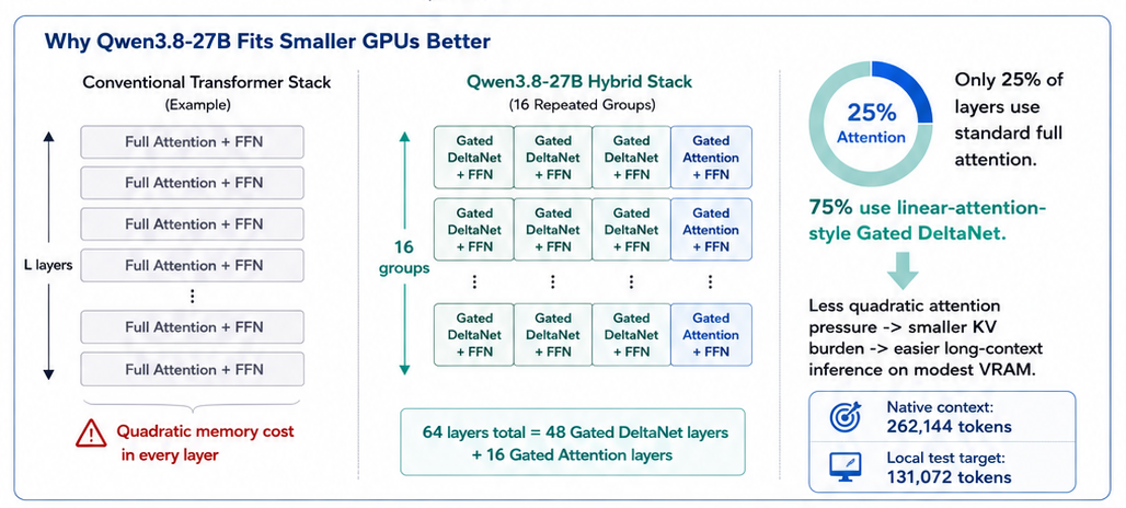
Research field report on fitting a 27B open model into a practical workstation build using llama.cpp, Vulkan, quantized KV cache, and Qwen’s hybrid Gated DeltaNet architecture. Qwen3.8-27B is a...
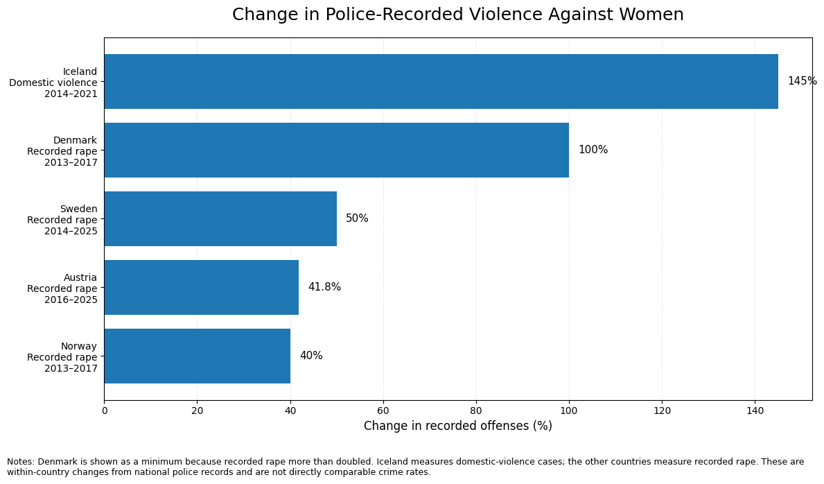
Excerpt: Denmark, Iceland, Norway, Sweden, and Finland rank among the world’s best countries for women. Their police records, however, tell a much less comfortable story about violence, reporting, and...
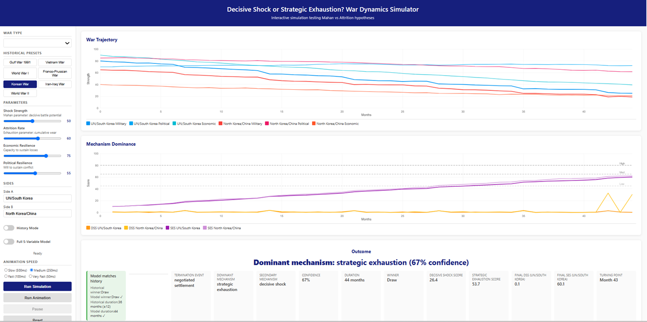
Mahan loved a clean finish; army collapses, a capital falls, a fleet is destroyed, or a government signs the surrender papers. The final event gets a name, a date,...
How delistings, failed contracts, shifting sales mixes, and investors who can’t do math can make a weak housing market look stronger than it is According to Zillow, Kootenai County...
Model Context Protocol tools are becoming the new browser extensions of AI development. There are thousands of them, they all promise to make an agent smarter, and installing too...